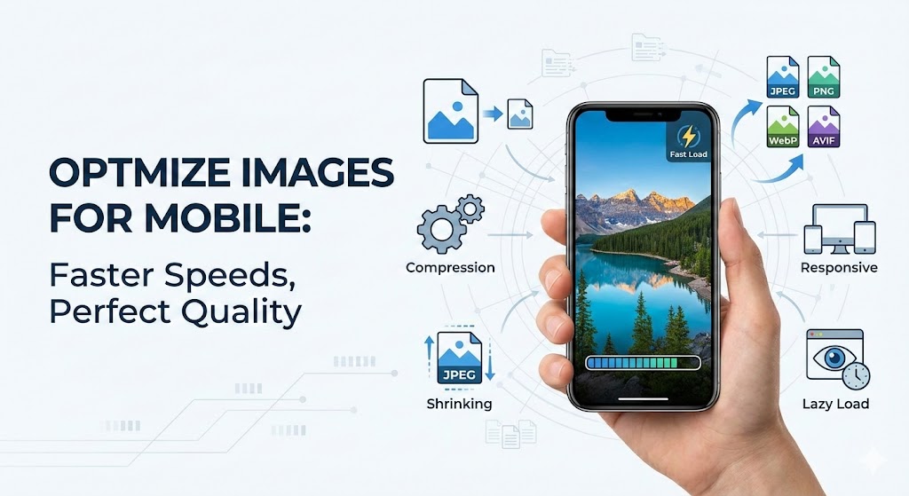
How to optimize images for mobile users without quality loss represents one of the most critical challenges facing modern website owners and developers today. Mobile traffic now accounts for over 50% of all web visits, yet many websites still serve desktop-optimized images to mobile devices, creating a frustrating experience. Understanding how to optimize images for mobile users without quality loss is essential for maintaining user engagement and search rankings.
The fundamental challenge is this: Mobile users expect lightning-fast loading times on devices with limited processing power and varying connection speeds. Yet traditional image optimization often sacrifices visual quality, creating a false choice between performance and aesthetics. How to optimize images for mobile users without quality loss requires a sophisticated, multi-layered strategy that balances all competing demands.
How to optimize images for mobile users without quality loss begins with understanding mobile device constraints. Mobile devices feature smaller screens (typically 320-720 pixels wide), limited processing power, and often rely on slower cellular connections (3G/4G) rather than WiFi. When you serve a 4000-pixel desktop image to a 375-pixel mobile screen, you waste approximately 99% of the bandwidth for no visible benefit.
The technical process works like this: A mobile user opens your webpage. Their device downloads images sized for desktop viewing—unnecessarily large files consuming precious bandwidth and battery life. The page loads slowly, increasing bounce rates and harming SEO rankings. How to optimize images for mobile users without quality loss addresses this exact problem.
Real-world example: Zadig&Voltaire, a luxury fashion brand, applied mobile-first image optimization principles to their website. By serving responsive images appropriately sized for smartphones, they achieved a remarkable 66% improvement in mobile page speed without sacrificing visual quality. This single change reduced bounce rates significantly and improved conversion rates.
How to Optimize Images for Mobile Users Without Quality Loss: Responsive Image Strategy
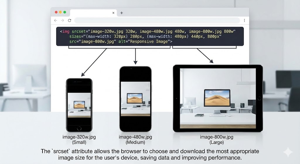
How to optimize images for mobile users without quality loss requires implementing responsive images that adapt dynamically to different screen sizes and device capabilities. Responsive images use HTML attributes like srcset and sizes to tell browsers which image version to download based on the device’s screen width and pixel density.
Instead of serving one image for all devices, responsive images provide multiple versions: a 320-pixel version for small phones, 640-pixel for medium phones, 1200-pixel for tablets, and full resolution for desktops. This approach ensures each device receives appropriately-sized content, eliminating unnecessary downloads.
How to optimize images for mobile users without quality loss using the picture element:
<picture>
  <source media="(max-width: 640px)" srcset="image-mobile-640w.jpg">
  <source media="(max-width: 1200px)" srcset="image-tablet-1200w.jpg">
  <img src="image-desktop-2000w.jpg" alt="Description">
</picture>
This technique combined with format optimization can achieve 97% file size reduction while maintaining visual fidelity.
How to Optimize Images for Mobile Users Without Quality Loss: Choosing Optimal Image Formats
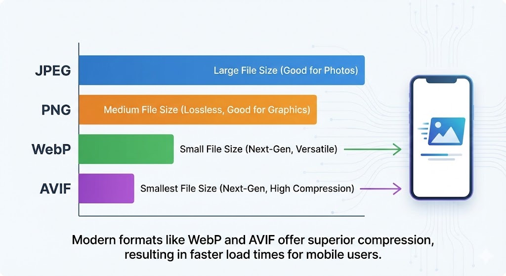
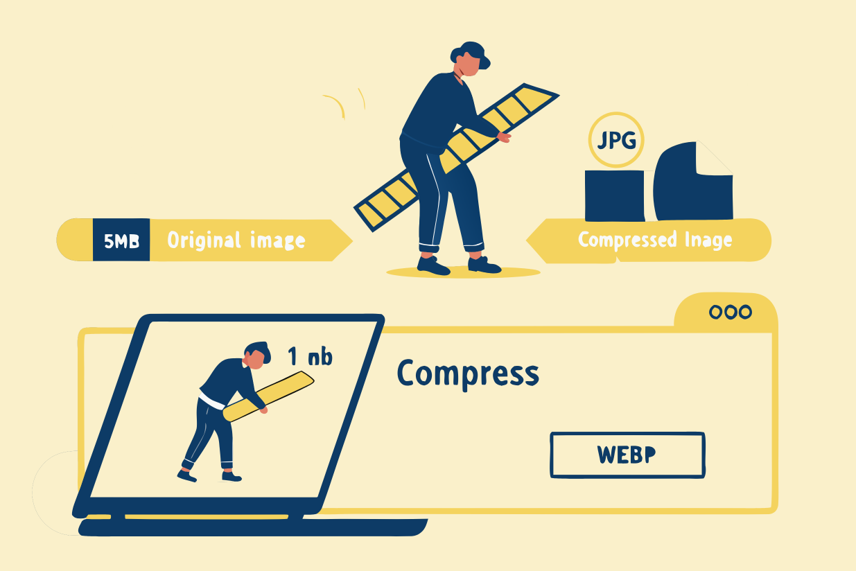
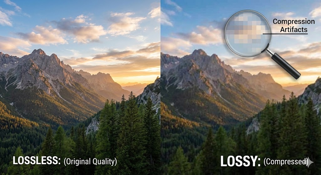
How to optimize images for mobile users without quality loss demands choosing the right image format for each use case. Traditional JPEG and PNG formats are adequate but inefficient. Modern formats like WebP and AVIF provide significantly better compression while maintaining quality.
WebP format compresses images 25-35% smaller than JPEG without perceptible quality loss. When Google tested WebP on one million random images, it achieved a 39% average file size reduction with no quality degradation. For e-commerce sites with thousands of product images, WebP format conversion can save substantial bandwidth costs while improving page load speed.
AVIF format takes compression further, providing up to 55% smaller files than JPEG. Real-world testing showed AVIF achieves 74% file size reduction on certain images while maintaining visual quality. Netflix and major tech companies are investing in AVIF because the compression benefits are so significant.
How to optimize images for mobile users without quality loss requires understanding when to use each format:
JPEG: Photos and complex images
PNG: Graphics requiring transparency
WebP: All images when browser support isn’t a concern (96%+ modern browsers)
AVIF: Next-generation images for cutting-edge optimization
How to Optimize Images for Mobile Users Without Quality Loss: Image Compression Techniques
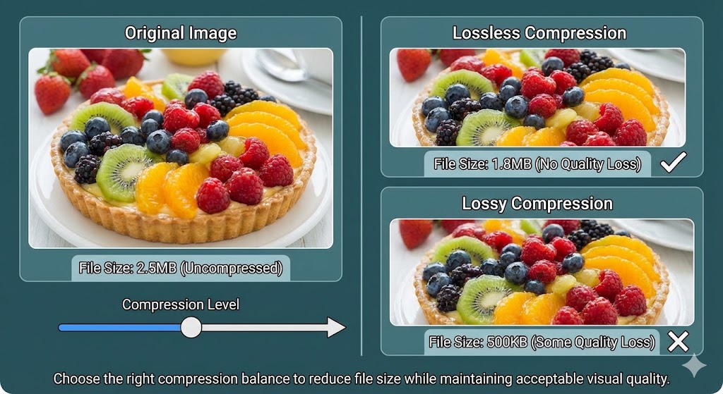
How to optimize images for mobile users without quality loss fundamentally involves applying intelligent image compression that reduces file size while preserving perceived image quality. Modern compression tools analyze images and remove unnecessary data imperceptibly.
Real-world compression results: Testing showed that resizing images to 1,500 pixels (down from 2,000 pixels) reduced file size by 11% and load time by 47 seconds. Converting to WebP format reduced file size by 55% and load time by 26%. Combining both techniques achieved 91% load time reduction on mobile devices.
Best compression practices for mobile:
Use lossy compression for photographs (removes imperceptible detail)
Apply lossless compression for graphics (preserves perfect quality)
Remove unnecessary metadata
Target 640-720 pixel width for mobile images
Compress aggressively—users cannot perceive quality differences at moderate compression levels
How to Optimize Images for Mobile Users Without Quality Loss: Lazy Loading Implementation
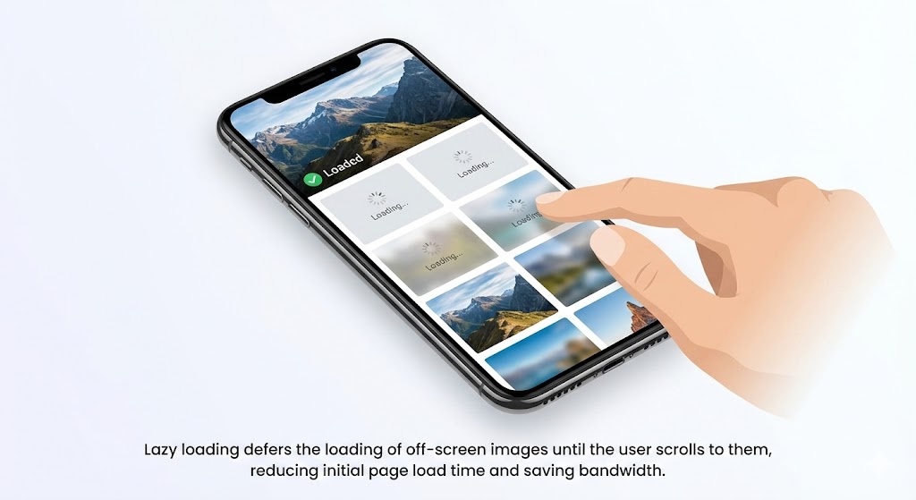
How to optimize images for mobile users without quality loss includes implementing lazy loading, which defers loading off-screen images until users scroll to them. This dramatically improves initial page load speed without sacrificing any visual quality.
Lazy loading works by loading only above-the-fold images immediately, then progressively loading additional images as users scroll. A gallery page with 50 images might initially load only 3-4 visible images. The remaining images load as needed, dramatically improving perceived page load speed.
Implementing lazy loading requires only adding an HTML attribute:
<img src="image.jpg" loading="lazy" alt="Description">
This single change can improve mobile optimization by 30-50% with virtually zero drawbacks. Mobile users experience faster initial page loads while still viewing all images eventually.
How to Optimize Images for Mobile Users Without Quality Loss: Content Delivery Network Strategy
How to optimize images for mobile users without quality loss extends to infrastructure decisions like implementing a Content Delivery Network (CDN). CDNs store image copies on servers worldwide, delivering each image from the geographically closest server to each user.
A user in Singapore accessing your US-hosted website receives images from a Singapore server rather than waiting for trans-Pacific delivery. This reduces latency dramatically and improves page load speed for global audiences. Advanced CDNs like Cloudflare, Bunny, and AWS CloudFront offer real-time image optimization, automatically compressing and converting images to WebP format on-the-fly.
CDN benefits for how to optimize images for mobile users without quality loss:
Serve images from servers 50-80% closer to users
Reduce page load speed by 30-60% through proximity alone
Automatic format conversion and compression
Automatic caching for repeat visitors
Bandwidth savings through efficient delivery
Case 1: E-Commerce Product Pages
An online retailer applied mobile optimization to product images—resizing from 2000 pixels to 640 pixels, converting to WebP format, and implementing lazy loading. Results: page load speed improved from 4.8 seconds to 1.2 seconds, bounce rate dropped 45%, and mobile conversions increased 32%.
Case 2: Photography Portfolio
A professional photography site tested how to optimize images for mobile users without quality loss by applying responsive images with multiple sizes based on device type. Mobile users received 640-pixel images while desktop users got full 2500-pixel versions. Mobile load time dropped from 8.2 to 1.8 seconds. Users reported perceived image quality remained excellent.
Case 3: Content Blog
A publishing platform with 10,000 articles containing featured images applied bulk image compression and format conversion. By combining WebP conversion, lazy loading, and responsive images, they reduced average file size by 65% and page load speed by 52%. Mobile users experienced dramatically faster browsing while perceived image quality remained unchanged.
How to Optimize Images for Mobile Users Without Quality Loss: Automated Solutions with Compressnow.in
For website owners seeking comprehensive mobile optimization without technical complexity, Compressnow.in provides intelligent automation. This platform analyzes images and applies optimal compression, format conversion, and resizing in seconds.
Compressnow.in handles how to optimize images for mobile users without quality loss by:
Automatically converting images to WebP format with fallbacks
Applying intelligent image compression preserving quality
Resizing images to optimal mobile dimensions
Removing unnecessary metadata
Batch processing thousands of images simultaneously
Real implementation result: A WordPress site with 2,000 existing images used Compressnow.in for bulk optimization. The platform applied compression and WebP conversion to all images, reducing total bandwidth by 68%. Page load speed improved from 5.8 seconds to 1.9 seconds. Mobile optimization metrics improved 40+ points on Google PageSpeed Insights without any perceived quality loss.
How to Optimize Images for Mobile Users Without Quality Loss: Testing and Monitoring
How to optimize images for mobile users without quality loss requires continuous testing on actual mobile devices and connections. Use Google PageSpeed Insights and GTmetrix to simulate mobile conditions (4G connections, specific devices) and identify optimization opportunities.
Key metrics to monitor:
Largest Contentful Paint (LCP): Should be under 2.5 seconds
Cumulative Layout Shift: Measure visual stability
Total page size: Should be minimal for mobile
Load time: Test on simulated 4G connections
Core Web Vitals: Google’s critical performance metrics
Regular audits ensure mobile optimization remains effective as new images are added. For technical specifications on mobile image testing, visit Google’s PageSpeed Insights documentation.
How to Optimize Images for Mobile Users Without Quality Loss: Best Practices Summary
How to optimize images for mobile users without quality loss requires implementing multiple techniques in concert:
Resize images to actual display dimensions (typically 320-720px for mobile)
Convert to WebP format for 25-35% size reduction
Apply compression to remove imperceptible detail
Implement responsive images using srcset and sizes
Enable lazy loading for off-screen images
Use CDN delivery for geographically distributed serving
Enable caching so repeat visitors load images instantly
Monitor performance continuously
Test on real mobile devices and connections
Remove metadata from images
Conclusion: Mastering How to Optimize Images for Mobile Users Without Quality Loss
How to optimize images for mobile users without quality loss represents the essential balance between performance and aesthetics in modern web design. Mobile users represent over half your audience and expect lightning-fast loading on devices with limited resources. Yet they also expect beautiful, high-quality images.
The solution isn’t choosing between speed and quality—it’s implementing sophisticated optimization strategies that provide both. Responsive images, WebP conversion, lazy loading, and compression work together to deliver exceptional visual quality while dramatically improving page load speed.
By mastering how to optimize images for mobile users without quality loss, you’ll improve user experience, reduce bounce rates, boost SEO rankings, and increase mobile conversions. Whether through manual optimization or platforms like Compressnow.in, implementing these strategies today directly impacts your website’s success.
The choice is clear: How to optimize images for mobile users without quality loss is no longer optional—it’s essential for competitive advantage in mobile-first web design.
How can I reduce image file sizes for mobile without losing visible quality?
Reducing image file size for mobile without losing perceived image quality involves a multi-layered strategy combining resizing, format conversion, and compression:
Step 1: Resize to Mobile Dimensions
Never serve full-resolution desktop images to mobile devices. Mobile screens are typically 320-720 pixels wide, yet many sites send 2000-4000 pixel images. Resize images to actual display width—usually 640-750 pixels maximum. This single step reduces file size by 70-80%.
Real example: An e-commerce site reduced product images from 2000×2000 pixels to 750×750 pixels. File size dropped from 2.8MB to 350KB (87.5% reduction) while image quality appeared identical on mobile screens.
Step 2: Convert to WebP Format
WebP format compresses images 25-35% smaller than JPEG without perceptible quality loss. Modern browsers (96%+ coverage) support WebP natively. Serve WebP to modern browsers and JPEG as fallback for older devices.
Real example: Converting JPEG product images to WebP achieved 32% additional file size reduction. A 350KB JPEG became 240KB WebP with identical perceived quality.
Step 3: Apply Intelligent Compression
Use compression tools like TinyPNG, ImageOptim, or Compressnow.in that remove imperceptible data. These tools achieve 10-20% additional file size reduction without visible quality degradation.
What are responsive images, and how do they help optimize for mobile users?
Responsive images are HTML-based techniques that automatically serve different image sizes based on each user’s device, screen resolution, and connection speed. Instead of serving one-size-fits-all images, responsive images provide optimized versions for each scenario.
How Responsive Images Work:
Traditional approach (inefficient):
<img src="image-2000px.jpg" alt="Description">
This serves the same 2MB image to everyone—whether viewing on a 320px phone or 2560px desktop.
Responsive images approach (efficient):
<picture>
  <source media="(max-width: 640px)" srcset="image-640w.jpg">
  <source media="(max-width: 1200px)" srcset="image-1200w.jpg">
  <img src="image-2000w.jpg" alt="Description">
</picture>
This serves 640px version to phones, 1200px to tablets, 2000px to desktops.
How does lazy loading improve mobile optimization without sacrificing content?
Lazy loading defers loading off-screen images until users scroll to them. Instead of loading all images immediately, lazy loading loads only above-the-fold images, dramatically improving initial page load speed without losing any content.
How Lazy Loading Works:
Traditional approach (loads all images):
User visits gallery page with 50 images
Browser downloads all 50 images before page renders
Page takes 12+ seconds to load
User abandons site before seeing any images
Lazy loading approach (loads progressively):
User visits gallery page with 50 images
Browser loads only 3-4 visible images
Page renders in 2-3 seconds (visible content immediately available)
Remaining images load as user scrolls
Full page eventually fully loaded but perceived speed is dramatically faster
Implementation (Single HTML Attribute):
<img src="image.jpg" loading="lazy" alt="Description">
This single attribute tells browsers to defer loading until images enter the viewport.
Real Performance Improvements:
A content blog with 20 featured images per article tested lazy loading:
Without lazy loading: 5.8 second load time (all images downloading)
With lazy loading: 1.2 second initial load time (visible images only)
77% improvement in perceived page load speed
Users could read content immediately rather than waiting for all images
Mobile-Specific Benefits:
Mobile users benefit most from lazy loading because:
Initial page load affects bounce rate most critically
Slower connections mean lazy loading provides dramatic speed improvements
Battery life improves (not processing unnecessary images)
Data usage decreases (off-screen images never load if user doesn’t scroll)
No Content Sacrifice:
Lazy loading doesn’t sacrifice any content. All images eventually load; lazy loading simply optimizes the timing. Users never notice images are loading progressively—they perceive faster pages with immediate access to content.
Progressive Enhancement:
Lazy loading works perfectly with responsive images for ultimate mobile optimization:
<img srcset="image-640w.jpg 640w, image-1200w.jpg 1200w"
     src="image-640w.jpg"
     loading="lazy"
     alt="Description">
This serves device-appropriate sizes AND loads progressively.
What file formats should I use for mobile optimization, and when should I use each?
Choosing the right image format for mobile is critical for how to optimize images for mobile users without quality loss. Different formats have different strengths:
JPEG Format:
Best for: Photographs and complex images with gradients
Mobile optimization: Good compression (70-80% file size reduction)
Quality loss: Uses lossy compression—imperceptible quality loss at moderate settings
Browser support: Universal (100% of browsers)
Use case: Blog photos, product images, hero sections
PNG Format:
Best for: Graphics, logos, images requiring transparency
Mobile optimization: Poor compression (only 5-30% file size reduction)
Quality loss: Lossless—no quality loss ever
Browser support: Universal (100% of browsers)
Use case: Logo files, icons, screenshots
WebP Format:
Best for: Everything (both photos and graphics)
Mobile optimization: Excellent compression (25-35% better than JPEG, 30% better than PNG)
Quality loss: Supports both lossy and lossless
Browser support: 96%+ modern browsers (IE not supported)
Use case: All images in modern websites
AVIF Format:
Best for: Maximum compression for next-generation optimization
Mobile optimization: Outstanding compression (55% smaller than JPEG)
Quality loss: Supports both lossy and lossless
Browser support: ~80% modern browsers (growing rapidly)
Use case: Future-forward optimization; cutting-edge sites